01 / primary voice
Pally.
Aa Bb Cc 0123456789
Headings, body, graphics and controls.
400500700
Get Pally from Fontshare 
SIPKVH brand guidelines
Built for kids. Chosen by parents.
Unmistakably SIPKVH.
Logos, colour, type and examples for every SIPKVH presentation, poster, graphic and website.
Version 1.4.0 · Updated
Read in order, or jump straight to the detail you need.
SIP Abacus Kasavanahalli teaches abacus and mental maths to children in Bengaluru. Our designs should welcome children and reassure their parents.
To give every child a calm, playful path to fast mental maths, and to give every parent good reason to trust it.
Choose the identity that matches the message. Always use the original artwork.

Centre posters, classes, events and parent communications.

The learning app, its interface and product guides.
Choose an app format ↓PNG · 6150 × 1050 px

PNG · 1539 × 263 px

PNG · 6150 × 1050 px

PNG · 96 × 96 px

SVG · scalable original paths
Use in recognised app contexts. The 96 px black icon is for small screens.
1×1×≥ 120 px wideLeave at least 1× on every side. Here, × is the SIP capital-letter height; for the app, use its symbol height.
Screen minimums. Enlarge for print and projection.
Keep the full institution name and lockup intact. On a coloured layout, give it a white panel. Only the supplied app lockup has a reversed white version.
White and ink lead. Brand green makes it ours. Choose one supporting family for each composition.
#16A34A#0A0A0B#71717A#FFFFFF#E4E4E8A playful way to see numbers.
Supporting words. A quieter voice.A playful way to see numbers.
Supporting words. A quieter voice.On a supporting colour, use its 950 shade for headings and 900 for supporting words. The QR frame has its own ink-border recipe.
#6EE7B7#34D399#064E3B#022C22#FDBA74#FB923C#7C2D12#431407#93C5FD#60A5FA#1E3A8A#172554#FDE047#FACC15#713F12#422006#FDA4AF#FB7185#881337#4C0519a little
colour.
a little
colour.
Use ink for small text on white. Green on white is for large text: 24 px regular or 18.67 px bold. Supporting emerald stays secondary to brand green.
Bold Pally leads our headings. Sentient adds selective editorial emphasis.
01 / primary voice
Aa Bb Cc 0123456789
Headings, body, graphics and controls.
02 / editorial companion
Aa Bb Cc 0123456789
Selective emphasis, reports and certificates.
little beads.
growing confidence.
LITTLE BEADS!!!
GROWINGconfidence!!!Use lowercase titles and end with a punctuation mark. Preserve proper names and acronyms.
make room for wonder.
Make Room For Wonder
Keep the name as written: “meet SIPKVH.”
room to grow.
one bead at a time.
Small, steady practice builds confidence.
SIP Abacus Kasavanahalli
Give one idea the most space. Let everything else support it.
small steps.
big confidence.
SMALL STEPS!
BIG CONFIDENCE!
The green blocks are identical. Only the white padding changes, in an 8 px rhythm. Phone content starts 24 px from the edge.
10–16 px20–32 pxKeep native website controls unchanged. QR frames use their own proportions.
room
to grow.
room
to grow.
Geometric shapes can decorate a layout. They cannot stand in for our bead, form an abacus or replace any part of a logo. Use them sparingly, away from words and logo clear space. Keep controls and photo frames rectangular, with softly rounded corners.
Match these website buttons and form controls when designing a new page.
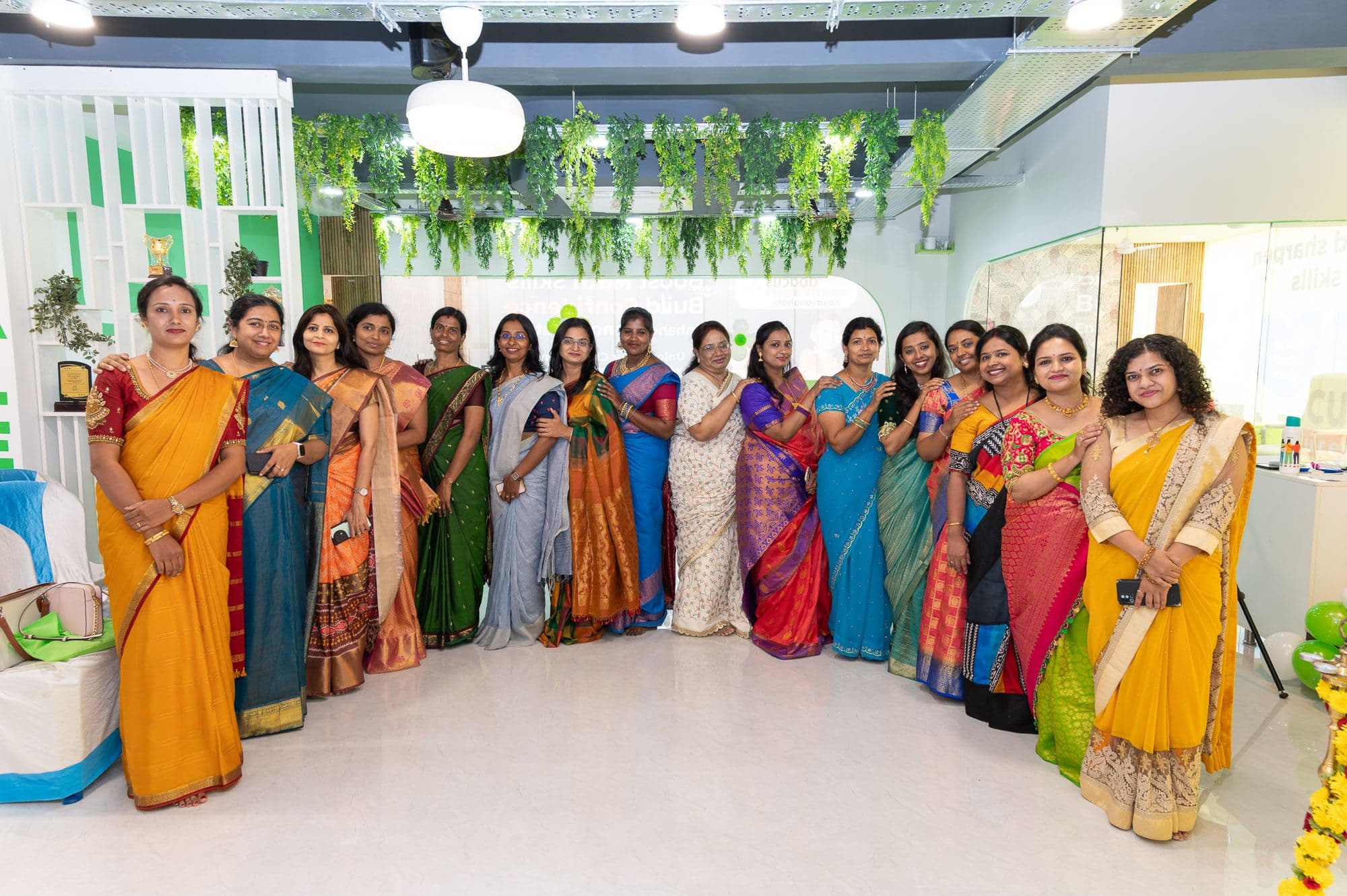
Use authorised photos of our students, teachers and centre. Keep faces, hands and skin tones natural.
Motion should help someone feel ready, understand a change or enjoy an interaction. Choose the job first, then the movement.
let’s begin.
Ready to begin.let’s begin.
Ready to begin.Exam-start feedback in the learning app.
Reduced motion. Keep the meaning. Change the movement. Show the ready state, complete explanation or confirmation immediately, without shaking, travelling or bouncing. Every word, action and focus state remains available.
Examples play only when requested and stop after a short comparison. No flashing.
Motion examples stopped.Speak to parents as trusted equals and children as capable people.
Give your child a calm, playful way to get fast at mental maths.
Unlock your child's limitless potential with our revolutionary program!!!
A clear path from the very first bead to full mental calculation.
Our best-in-class curriculum is truly second to none.
Write “colour”, “centre” and “maths”. For example: “Enrol at our centre”, rather than “Enroll at our center”. Keep official names unchanged.
Give each sentence one job. “Practise for ten minutes. Bring your abacus.” Use full stops or commas instead of em dashes.
Describe the real benefit: “Build confidence through steady practice.” Never promise “Guaranteed top marks” or invent achievements, results or testimonials.
Keep the same type, space and signature bead. Adapt the layout to the format.
make room
for a little
wonder.
our centre Layout studies, shown at reduced size.
A4 / A3 · 3 mm bleed* · 300 dpi
Headline → essential details → one action.1080 px wide · 1080 / 1350 / 1920 px tall
One message, readable in a phone preview.Phone first · 24 px phone gutters
Use the same controls and hierarchy at every size.For steady practice and growing confidence
in mental maths.
Sentient leads · Pally supports
The name leads. Use verified wording and an authorised signatory.* Confirm bleed and colour profile with the printer. These are format studies. Bracketed fields are placeholders, not issued credentials.
Generate a real SIPKVH QR. Give it space, add a readable link and test the final artwork.

PDF reference measurements. Preview scales to fit.
Preserve the generated modules, finders and original app mark. No recolouring, stretching, extra logo or animation.
Keep the white margin included in the PNG. Our PDF frame uses a 2 px ink border, 4 px padding and 8 px corners around a 60 px code. Scale these together, with labels outside.
Scan the exported phone preview, printed proof or projected slide. Confirm the exact destination and include a readable URL.
Use sipkvh.app/qrcode with data set to the URL-encoded destination and w set to the square size in pixels (up to 1000; default 300). It returns a PNG. The form above uses a 1000 px image with a 59 px outer margin to match our PDF framing. Other callers can set the optional margin; its default is zero.
The logo margin is not the quiet zone. For a larger export, generate at the required resolution with these same settings. Never upscale a small raster code or draw a QR with AI.
Check the actual phone preview, projected slide or printed proof.
One complete prompt, ready for a fresh project. Add your brief; the rules, component recipes, fonts and original asset links are included.
Copy the prompt, fill in the three brief fields, then paste it into your design tool. No private files or component library needed.
Guide v1.4.0